We’ve all heard it. Billboards are dead and they don’t work anymore. But you can’t believe everything you hear. Our team decided to take on the challenge of bringing billboard advertising into today’s digital landscape with our interactive and sharable VisionAF campaign.
How to Make a Billboard Stand Out
We first needed to come up with our concept. This is where we throw all our creatives in a room, lock the door, and withhold coffee until they come up with something great. Just kidding. But after a fun brainstorm session, our creatives came up with the VisionAF campaign. “AF” (standing for “as f-word”) is a trendy term right now that people use when they are “extra” at something. Hungry AF, Long Beach AF, Artsy AF, etc. Utilizing a catchphrase that most people use on social media is a creative solution to bridge the gap between traditional advertising, like billboards and print, with digital advertising like social media, web, and emails.
What does Vision AF Mean?
Having an entrepreneurial spirit, forming partnerships with our clients, and producing killer creative are three of the VDS pillars that we believe are Vision AF. There’s a feeling that clients get when working with us that is warm and personal which makes our agency stand out from larger, more corporate agencies. Whether it’s our unpredictable creative spin on campaigns in the beauty or education industries, or our passion for helping nonprofits spread their mission in a smart and stylish way, once someone works with us they quickly understand what’s Vision AF, and that’s what keeps them coming back to work with us even more.
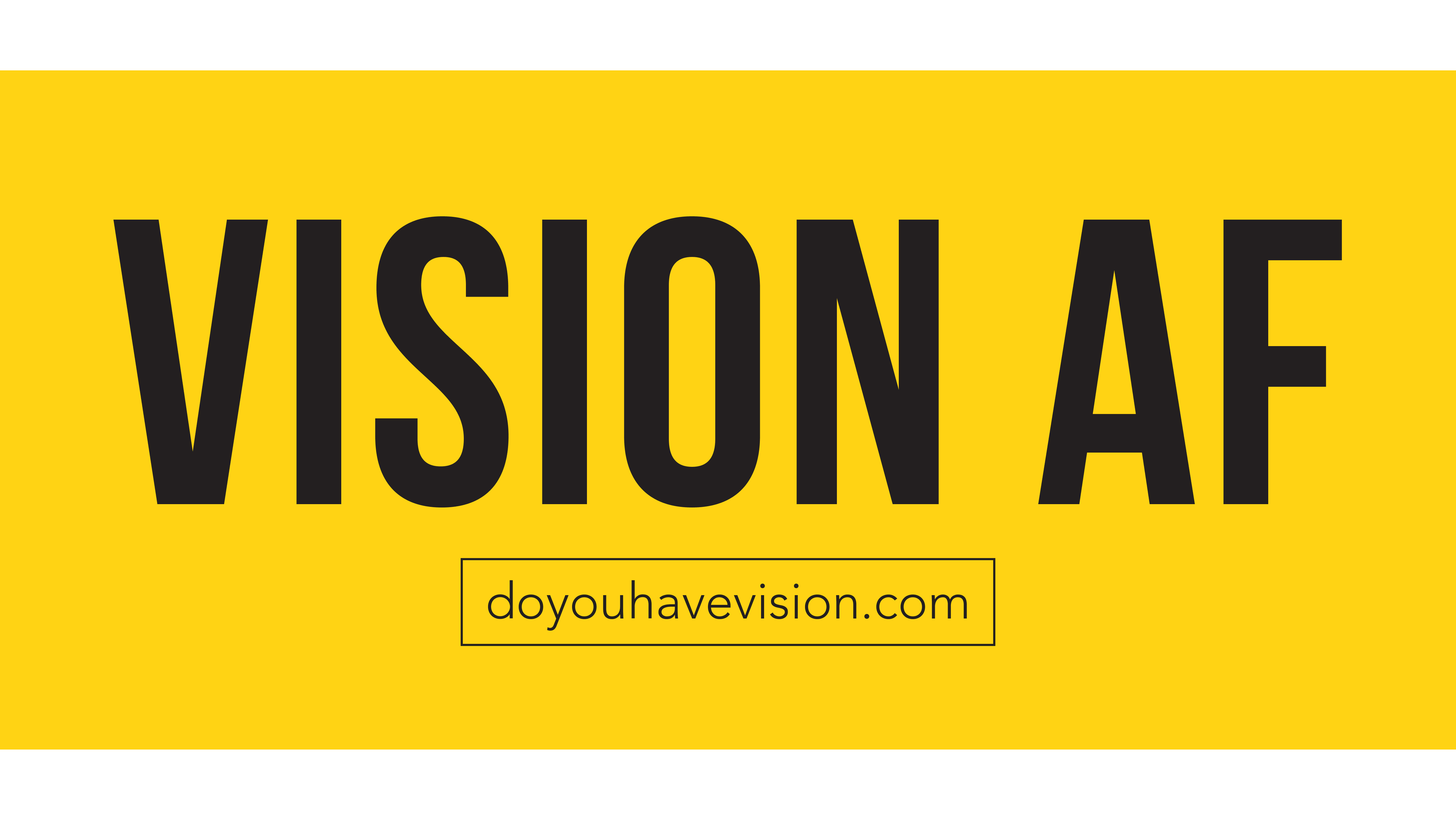
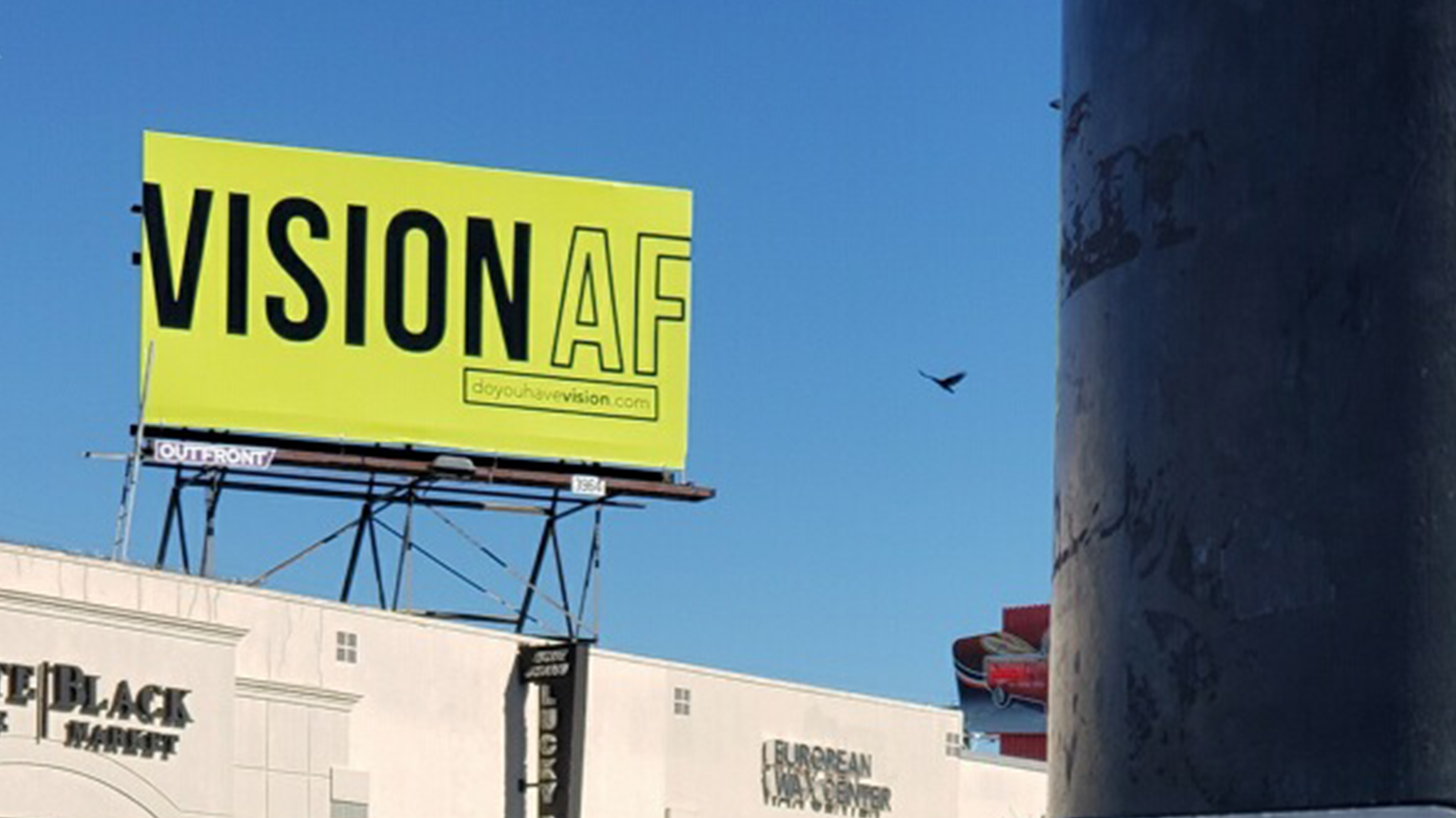
Why We Went With This Design
We went through a few different versions before we decided on the bold, green and black design. Above are some examples. A lot of billboards are not effective because the design is not done very well. It’s too crowded or confusing, with an overwhelming amount of colors or text, which defeats the purpose because you need people to be able to digest the content quickly, like while they are driving by in a car, for example. We chose a big and bold design that will catch people’s attention, make them smile, and spark their curiosity enough to visit our landing page doyouhavevision.com. The website is the only CTA on the billboard – literally. It doesn’t say “visit doyouhavevision.com to learn more,” or “check out our website at doyouhavevision.com.” We trust that our audience is intelligent enough to know that if a website is listed on a billboard, that’s probably where they should go to find out more.
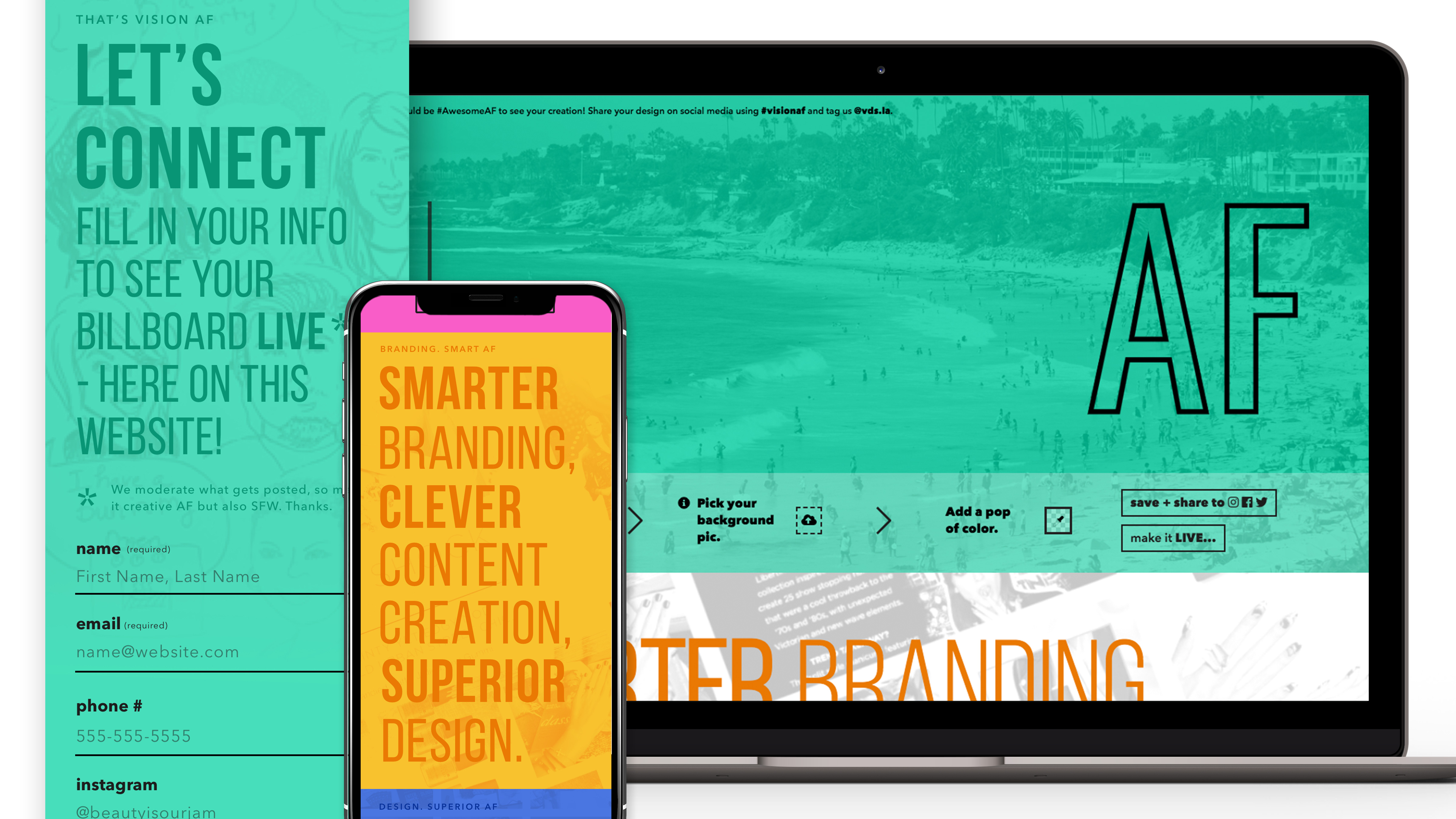
Our Interactive and Lead Generating Landing Page
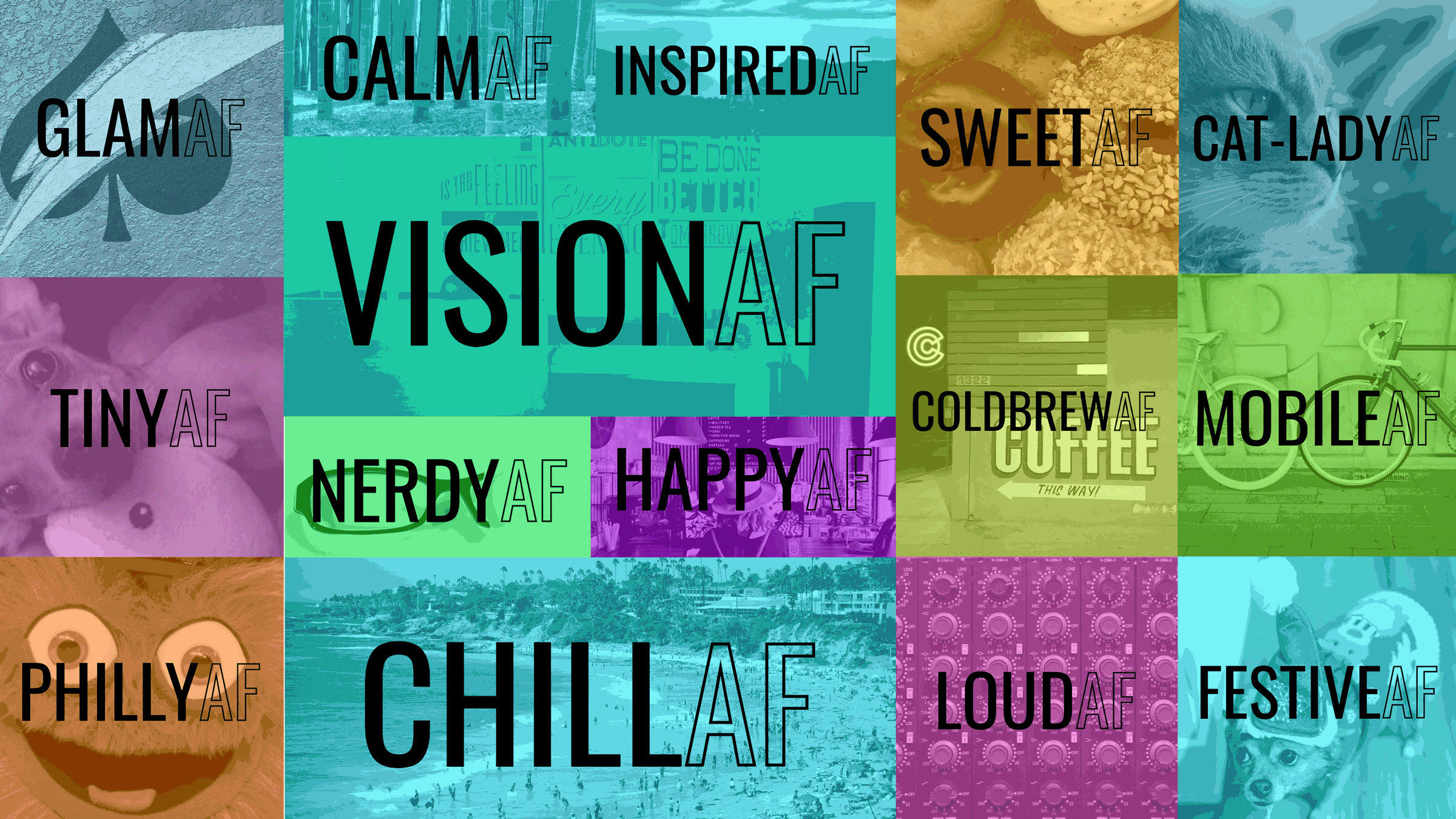
Landing pages can be predictable and a little boring, which is something we definitely wanted to avoid. Because a lot of people have used the “AF” term already we thought it would be fun to let them put their “AF” into our design and share it on their social media using the hashtag #visionaf. When someone lands on our page they can fill in the text, choose a color, choose a background image, and then download their custom design to do with it as they please. (Ideally, they will share it on their social media sites.)
After that experience, they can scroll down to learn more about us, see some of our work, and then fill out our contact form if they want to. Our concept was to give the person visiting our page a fun and valuable experience, a gentle introduction to what we do, a wonderful UX/UI design experience throughout, and clever copy to keep them reading until the end. Being salesy or pushy is NOT #VisionAF so we made sure that our landing page wasn’t, either.
Customized and Branded Email Follow-Up
Once someone enters their information they will receive a branded email confirmation that we got their message. It’s important to let people know that we hear them, we see them, and we’re excited to work with them. Once we get that conversation started and decide if working together is a good fit, we get things rolling. It doesn’t take very long for clients to “get” what we mean by VisionAF during our partnership, and that’s something we are very proud of.